Give interface craft a concrete record: the screen hierarchy you changed, states you specified and implementation you checked. Compare three builder designs, read a complete UI designer example and learn how to connect the resume to permission-safe portfolio evidence.
These previews use the same layouts as the builder, with identical example content. Open a full preview to inspect the text and spacing.
Fictional candidate, employers, education and results. The optional portrait is AI-generated. Use your own evidence and photo; the example is not inserted into your resume.
Studio
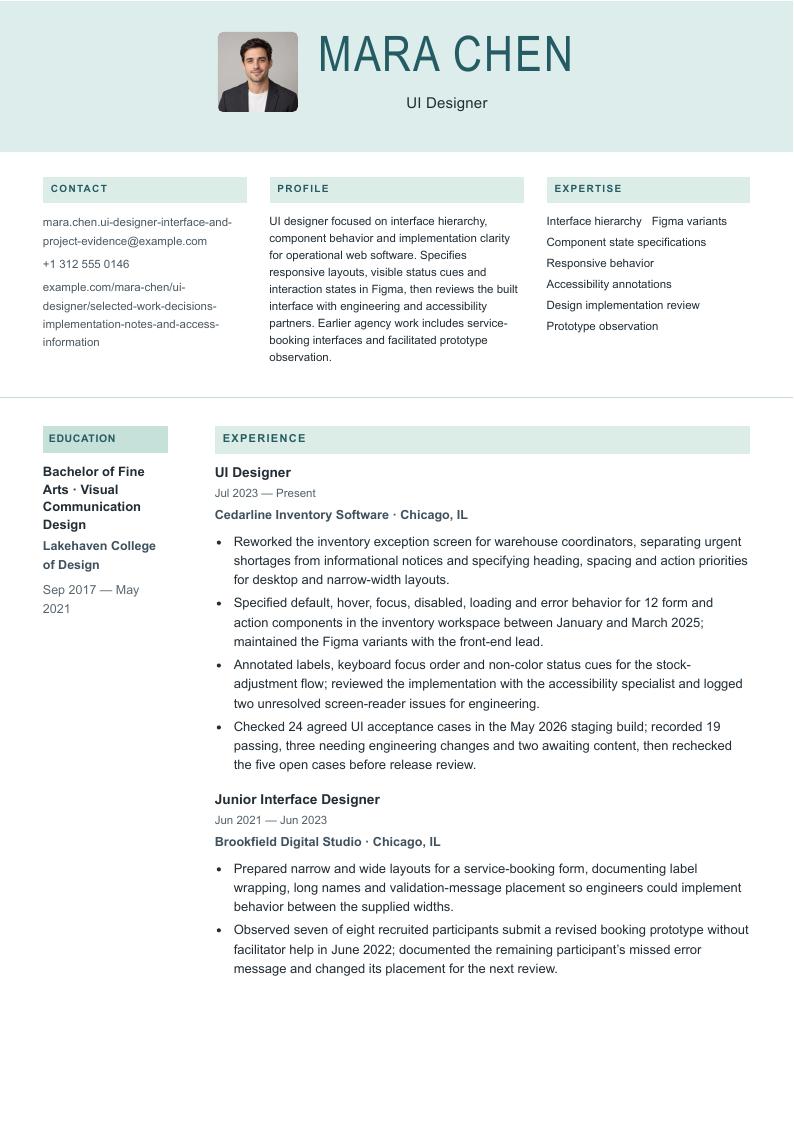
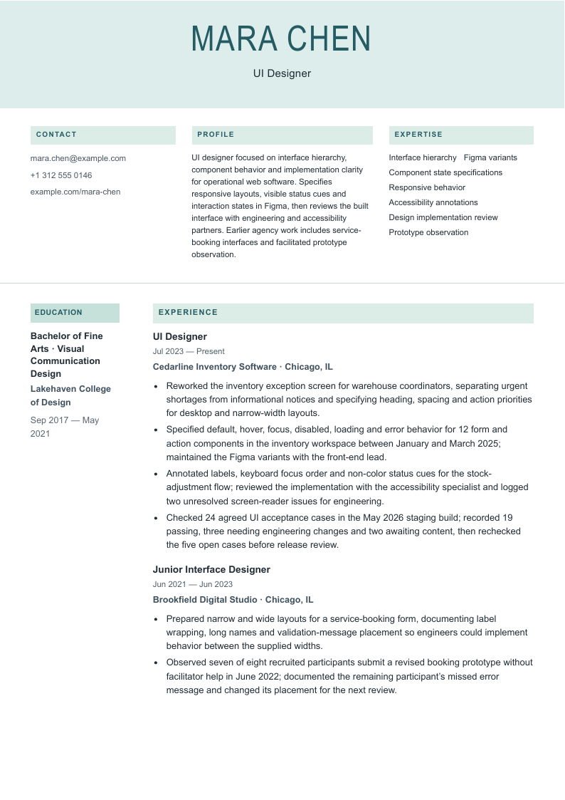
A centered identity sits above separate contact, profile and expertise areas; teal section bands separate the education rail from experience and projects.
Before sending: Contact, summary and skills each occupy a narrow introduction area. Inspect long portfolio addresses and every education and project continuation before sending.
A single-column body follows the identity and contact header, using small square markers, colored section headings and a date gutter.
Before sending: Projects follow experience, expertise and education. Check later pages as well as the opening screen, especially project links and the dates beside longer entries.
A plain left-aligned header and restrained headings present the record in a single-column sequence with dates in a small gutter.
Before sending: The full record determines the exported length. Keep state names and test limitations readable; a quieter design does not validate claims or guarantee parsing.
“Use” opens signup with that design and photo preference selected for the builder. A free account is required. Free-plan PDF downloads include a watermark; see current plans for paid options. Photo conventions vary; follow the employer’s instructions and local expectations.
The three designs use the identical complete record below, with no photo selected by default and an optional AI-generated fictional portrait. Open each preview to inspect every exported page. Choose the hierarchy that keeps your evidence readable; there is no verified popularity ranking or template that guarantees an interview. The example is not inserted into your account.
Compare the actual section placement in Studio, Signal, Essential. Follow the employer’s file and photo instructions; the default shown here is intended as a starting point for US applications, not a rule for every location.
A complete ui designer resume example
Mara Chen is a fictional UI designer working on inventory software for warehouse coordinators, after an agency interface-design role. Every person, employer, qualification and result is invented. The portfolio and project destinations use example.com; they illustrate where links belong and are not candidate work to copy.
UI designer focused on interface hierarchy, component behavior and implementation clarity for operational web software. Specifies responsive layouts, visible status cues and interaction states in Figma, then reviews the built interface with engineering and accessibility partners. Earlier agency work includes service-booking interfaces and facilitated prototype observation.
Reworked the inventory exception screen for warehouse coordinators, separating urgent shortages from informational notices and specifying heading, spacing and action priorities for desktop and narrow-width layouts.
Specified default, hover, focus, disabled, loading and error behavior for 12 form and action components in the inventory workspace between January and March 2025; maintained the Figma variants with the front-end lead.
Annotated labels, keyboard focus order and non-color status cues for the stock-adjustment flow; reviewed the implementation with the accessibility specialist and logged two unresolved screen-reader issues for engineering.
Checked 24 agreed UI acceptance cases in the May 2026 staging build; recorded 19 passing, three needing engineering changes and two awaiting content, then rechecked the five open cases before release review.
Junior Interface Designer
Brookfield Digital Studio · Chicago, IL
June 2021–June 2023
Prepared narrow and wide layouts for a service-booking form, documenting label wrapping, long names and validation-message placement so engineers could implement behavior between the supplied widths.
Observed seven of eight recruited participants submit a revised booking prototype without facilitator help in June 2022; documented the remaining participant’s missed error message and changed its placement for the next review.
Education
Bachelor of Fine Arts in Visual Communication Design · Lakehaven College of Design
September 2017–May 2021
Projects
Inventory adjustment state reference
UI designer · Cedarline Inventory Software
January 2025–March 2025
Figma · Component state matrix · Staging review
Recorded the 12 component families and their applicable states, including loading, validation and unavailable actions. Paired examples with usage notes so an error was not communicated through color alone. Reviewed naming and feasibility with the front-end lead; engineers implemented the components. This reference documents interface decisions and does not establish company-wide adoption or accessibility conformance.
Explain interface decisions beyond a gallery of screens
A UI designer resume should let a reader identify the product surface, its users and the interface decisions you made. Mara’s inventory workspace example starts with competing notices and actions, then shows reusable states, responsive behavior and review of the implemented flow. The unit of evidence is a decision in context, rather than a list of software or a claim that the screens were intuitive.
Keep the summary narrow enough for the work history to support. Mara describes operational web interfaces and implementation clarity; the record does not establish native-app expertise, research-program leadership or ownership of a company-wide system. In your own experience, separate a design-system contribution from maintaining its governance, adoption and release process. Twelve components are a defined artifact count, not proof that an entire organization used them.
Employer titles overlap. Wix’s UI role works across product, visual language and systems; Wargaming’s game UI role includes analysis and implementation guidance; Ubiquiti combines UX and UI in one title. Those examples support reading the actual responsibilities, not treating UI as a universal boundary around visual work. Keep your real title and explain the parts you owned. This guide emphasizes interface execution; the adjacent product designer guide follows a broader product decision through discovery and delivery.
When writing about accessibility, name the actual checks and their limits. W3C’s designing guidance covers matters such as clear labels, distinguishable interaction and information that does not depend on color alone. A design file can specify those intentions; implementation review establishes something different. Mara records specialist collaboration and unresolved screen-reader issues. Do not turn those actions into a whole-product compliance or certification claim.
Six annotated ui designer resume bullet rewrites
Every after version below appears in the base resume. The before versions deliberately overstate or obscure the work. Use the evidence questions to rewrite your own experience; none of these fictional names, counts or results belong in your application.
Hierarchy with a defined surface
Before: Created stunning, intuitive dashboards.
After: Reworked the inventory exception screen for warehouse coordinators, separating urgent shortages from informational notices and specifying heading, spacing and action priorities for desktop and narrow-width layouts.
Why it works: Names the user, screen and hierarchy choices. Visual polish alone does not establish usability or commercial impact.
Evidence to check: Before/after screen files, layout rules, review notes and the implemented screen.
Components with counted scope
Before: Built a complete enterprise design system.
After: Specified default, hover, focus, disabled, loading and error behavior for 12 form and action components in the inventory workspace between January and March 2025; maintained the Figma variants with the front-end lead.
Why it works: Twelve counts component families, not screens or every variant. The work contributes to one workspace; it does not claim ownership of the entire company system.
Evidence to check: Component inventory, version history, state matrix and the front-end review.
Accessibility work with a bounded claim
Before: Made the product fully WCAG compliant.
After: Annotated labels, keyboard focus order and non-color status cues for the stock-adjustment flow; reviewed the implementation with the accessibility specialist and logged two unresolved screen-reader issues for engineering.
Why it works: States concrete work and unresolved issues. Design annotations and one review cannot certify the whole product or its legal compliance.
Evidence to check: Annotated flow, specialist review, issue IDs and retest status.
Implementation checks that reconcile
Before: Eliminated every design bug before launch.
After: Checked 24 agreed UI acceptance cases in the May 2026 staging build; recorded 19 passing, three needing engineering changes and two awaiting content, then rechecked the five open cases before release review.
Why it works: The first review reconciles: 19 + 3 + 2 = 24. Rechecking does not itself say all five passed, and the designer did not own the release decision.
Evidence to check: Dated case list, staging build identifier, issue links and recheck notes.
Responsive behavior beyond artboards
Before: Designed pixel-perfect responsive websites.
After: Prepared narrow and wide layouts for a service-booking form, documenting label wrapping, long names and validation-message placement so engineers could implement behavior between the supplied widths.
Why it works: Two layouts are not proof that every device works. The useful contribution is the behavior rule for content and intermediate sizes.
Evidence to check: Responsive specifications, long-content examples and implemented-width checks.
Testing without a conversion story
Before: Increased conversion by 87.5% through better UI.
After: Observed seven of eight recruited participants submit a revised booking prototype without facilitator help in June 2022; documented the remaining participant’s missed error message and changed its placement for the next review.
Why it works: Seven divided by eight is 87.5% within this small prototype session. It is neither a production conversion rate nor a measured increase against a baseline.
Evidence to check: Recruitment criteria, task script, assistance rule, session notes and prototype version.
Make each skill point to work you can explain
Choose a short list of skills the target description asks for and your experience demonstrates. Put Figma beside the work it enabled: variants, component rules or prototype revisions. A long software inventory cannot replace an explanation of what you designed. If you only observed research sessions, preserve that distinction from planning or moderating them.
The UI acceptance count is deliberately bounded. Nineteen passing cases plus three engineering changes and two content dependencies equals 24 cases in the first review. The five rechecks are follow-up work, not an automatic claim of five additional passes. Similarly, seven of eight prototype participants completing a task does not establish a booking-conversion increase.
UI Designer skills and evidence in the fictional resume
Skill
Evidence to gather
Example in this record
Interface hierarchy
The task, competing content and decisions about emphasis.
Urgent shortages are separated from informational notices.
Component specifications
A component inventory, applicable states and usage rules.
Twelve form/action families with state behavior, not a company-wide system claim.
Accessibility annotations
The specific behavior reviewed, partners and unresolved findings.
Labels, focus order and non-color status cues; two issues remain logged.
Responsive design
Content and layout behavior between supplied widths.
Long names, wrapped labels and validation placement.
Implementation review
Defined cases, build, statuses and follow-up.
24 cases reconcile to 19 pass, three engineering and two content items.
Figma and collaboration
Variants or files and the engineering decisions they supported.
Maintains the workspace state reference with the front-end lead.
Connect the portfolio to the same interface evidence
Use one working portfolio URL near your contact details, then make a case study easy to match to the resume. For Mara’s state-reference work, the useful material would show component anatomy, an applicable-state matrix, a reason for an exception and what changed during engineering review. A large screen gallery without those explanations would leave the resume’s claims untested.
Explain what you made personally and what existed before you joined. Credit researchers, content designers, accessibility specialists and engineers where relevant. Show the decision between options and the check on the built interface, including an unresolved item if that is the honest final state. Clearly label a prototype, implementation and independent exercise so a reviewer can distinguish them.
Check access in a signed-out browser and on a phone. A portfolio that requires a company login may be inaccessible to the hiring team. If a permitted case study is password-protected, follow the application’s instructions for sharing access; a password does not grant permission to publish confidential work. Remove customer records, private analytics and internal links. Where disclosure is restricted, use an approved redacted explanation or offer an authorized discussion of process.
Describe education and learning accurately
List the qualification, field, institution and dates you actually earned. Mara’s fictional visual communication degree is one route into UI work, not an entry requirement established by this guide. The three employer examples differ in context and experience expectations; read the specific vacancy before deciding which study or credential is relevant.
For a course or certificate, identify the real provider and completion status. A Figma course is evidence of training, not proof of production implementation, accessible behavior or system adoption. A clearly labeled course project can support a first application when you explain its brief, your contribution and the fact that it was not a client launch.
Show UI readiness before your first designer job
Use an internship, support role, volunteer contribution or independent interface project if it shows relevant decisions. State the source of the brief and the level of supervision. A first UI application can demonstrate thoughtful layout, content resilience and response to feedback without inventing production users or a conversion metric.
If your project was a redesign exercise, say so. Do not imply a real company commissioned it, that engineers shipped it or that recruited classmates represent the customer population. Explain a specific revision after critique and what you would still need to validate.
Fictional early-career adaptation
Design assistant seeking a first UI designer role. Prepares assets and tests long service names against supplied layouts under a senior designer’s direction. In a clearly labeled independent form exercise, documented error, loading and disabled states, then revised label wrapping after critique; no production use or customer result was measured.
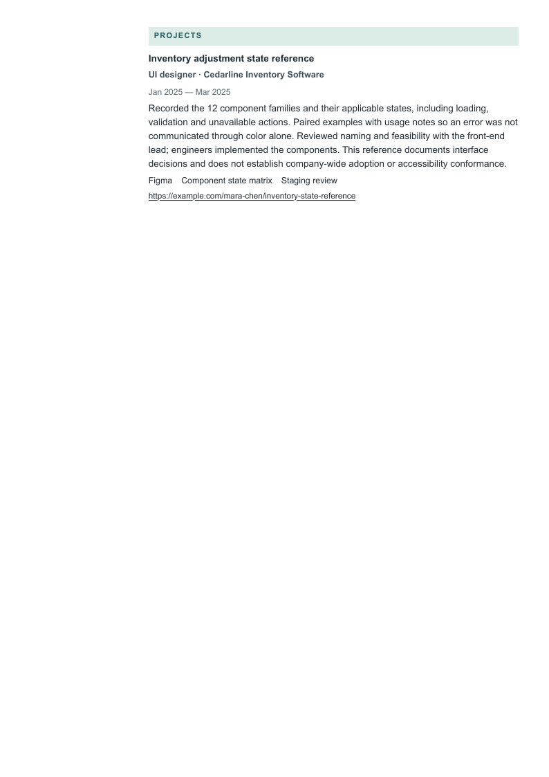
Inspect long contact details with the photo on
This Studio stress example changes only the resume email and portfolio contact URL; Mara’s career, skills, dates and project remain identical. The optional photo is on. The complete record below exposes the full contact strings so you can compare the last characters and linked destination against every exported page.
Studio places contact details in one of three introductory areas, so long strings deserve a deliberate inspection. Signal and Essential use full contact headers with a different wrapping context. Do not shorten your real destination merely to make a preview tidy; use a clear, stable address and test the actual PDF link.
UI designer focused on interface hierarchy, component behavior and implementation clarity for operational web software. Specifies responsive layouts, visible status cues and interaction states in Figma, then reviews the built interface with engineering and accessibility partners. Earlier agency work includes service-booking interfaces and facilitated prototype observation.
Reworked the inventory exception screen for warehouse coordinators, separating urgent shortages from informational notices and specifying heading, spacing and action priorities for desktop and narrow-width layouts.
Specified default, hover, focus, disabled, loading and error behavior for 12 form and action components in the inventory workspace between January and March 2025; maintained the Figma variants with the front-end lead.
Annotated labels, keyboard focus order and non-color status cues for the stock-adjustment flow; reviewed the implementation with the accessibility specialist and logged two unresolved screen-reader issues for engineering.
Checked 24 agreed UI acceptance cases in the May 2026 staging build; recorded 19 passing, three needing engineering changes and two awaiting content, then rechecked the five open cases before release review.
Junior Interface Designer
Brookfield Digital Studio · Chicago, IL
June 2021–June 2023
Prepared narrow and wide layouts for a service-booking form, documenting label wrapping, long names and validation-message placement so engineers could implement behavior between the supplied widths.
Observed seven of eight recruited participants submit a revised booking prototype without facilitator help in June 2022; documented the remaining participant’s missed error message and changed its placement for the next review.
Education
Bachelor of Fine Arts in Visual Communication Design · Lakehaven College of Design
September 2017–May 2021
Projects
Inventory adjustment state reference
UI designer · Cedarline Inventory Software
January 2025–March 2025
Figma · Component state matrix · Staging review
Recorded the 12 component families and their applicable states, including loading, validation and unavailable actions. Paired examples with usage notes so an error was not communicated through color alone. Reviewed naming and feasibility with the front-end lead; engineers implemented the components. This reference documents interface decisions and does not establish company-wide adoption or accessibility conformance.
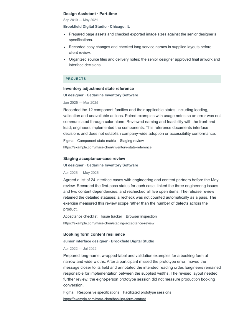
This Studio example has the photo off and retains the entire base record. It adds Mara’s earlier part-time design-assistant role plus the staging acceptance review and booking-form resilience projects, with roles, dates, tools, descriptions and URLs shown below. No record is reduced to force a page count.
Read all continuation pages, including the education rail and the end of each project. A larger record is useful here as a layout stress check. For an application, keep the evidence that helps the target role and preserve readable text; neither a one-page promise nor extra pages can compensate for unsupported claims.
UI designer focused on interface hierarchy, component behavior and implementation clarity for operational web software. Specifies responsive layouts, visible status cues and interaction states in Figma, then reviews the built interface with engineering and accessibility partners. Earlier agency work includes service-booking interfaces and facilitated prototype observation.
Reworked the inventory exception screen for warehouse coordinators, separating urgent shortages from informational notices and specifying heading, spacing and action priorities for desktop and narrow-width layouts.
Specified default, hover, focus, disabled, loading and error behavior for 12 form and action components in the inventory workspace between January and March 2025; maintained the Figma variants with the front-end lead.
Annotated labels, keyboard focus order and non-color status cues for the stock-adjustment flow; reviewed the implementation with the accessibility specialist and logged two unresolved screen-reader issues for engineering.
Checked 24 agreed UI acceptance cases in the May 2026 staging build; recorded 19 passing, three needing engineering changes and two awaiting content, then rechecked the five open cases before release review.
Junior Interface Designer
Brookfield Digital Studio · Chicago, IL
June 2021–June 2023
Prepared narrow and wide layouts for a service-booking form, documenting label wrapping, long names and validation-message placement so engineers could implement behavior between the supplied widths.
Observed seven of eight recruited participants submit a revised booking prototype without facilitator help in June 2022; documented the remaining participant’s missed error message and changed its placement for the next review.
Design Assistant · Part-time
Brookfield Digital Studio · Chicago, IL
September 2019–May 2021
Prepared page assets and checked exported image sizes against the senior designer’s specifications.
Recorded copy changes and checked long service names in supplied layouts before client review.
Organized source files and delivery notes; the senior designer approved final artwork and interface decisions.
Education
Bachelor of Fine Arts in Visual Communication Design · Lakehaven College of Design
September 2017–May 2021
Projects
Inventory adjustment state reference
UI designer · Cedarline Inventory Software
January 2025–March 2025
Figma · Component state matrix · Staging review
Recorded the 12 component families and their applicable states, including loading, validation and unavailable actions. Paired examples with usage notes so an error was not communicated through color alone. Reviewed naming and feasibility with the front-end lead; engineers implemented the components. This reference documents interface decisions and does not establish company-wide adoption or accessibility conformance.
Agreed a list of 24 interface cases with engineering and content partners before the May review. Recorded the first-pass status for each case, linked the three engineering issues and two content dependencies, and rechecked all five open items. The release review retained the detailed statuses; a recheck was not counted automatically as a pass. The exercise measured this review scope rather than the number of defects across the product.
Prepared long-name, wrapped-label and validation examples for a booking form at narrow and wide widths. After a participant missed the prototype error, moved the message closer to its field and annotated the intended reading order. Engineers remained responsible for implementation between the supplied widths. The revised layout needed further review; the eight-person prototype session did not measure production booking conversion.
Read the interface evidence at normal size. Check state names, accessibility limitations, component scope and every final project line on all pages.
Copy text and open links. Confirm the reading order, email, phone, portfolio and project destinations. A visual column arrangement does not prove the same extraction order.
Reconcile every number. Keep 12 component families distinct from variants; preserve the 24-case status breakdown and the eight-person prototype context.
Review the submitted form. Use the requested file type and check parsed titles, dates and contacts after upload. A PDF that looks good locally does not guarantee every application system reads it correctly.
Review your resume with the analyzer and assess each suggestion against the actual job and your records. The design buttons open signup with the selected template and photo preference; a free account is required. Free-plan PDFs include a watermark. The preview images here show complete paid-plan output without that watermark.
Questions, answered
Should a UI designer resume look like a portfolio?
Use the resume to state scope, work history and evidence clearly, then link to permission-safe case studies that demonstrate craft and decisions. You can compare distinct visual layouts here, but decorative complexity does not prove interface ability.
Can I write UI/UX Designer if that was not my job title?
Preserve the real employment title. Explain research, interaction and interface contributions in the summary and bullets when you did them. Employer titles overlap; a target-role heading should not rewrite your employment history.
Is a component count a strong result?
It can establish scope when you define what counts and your contribution. It does not establish adoption, quality, accessibility or business impact on its own. Include the states, usage rules or implementation decision that made the work useful.
Do I need a photo?
The examples default to no photo for this US-oriented guidance and offer an optional fictional AI portrait to inspect the layout. Follow the employer’s instructions and local expectations. The photo preference does not change the fictional record or add it to your account.
Continue with the relevant resource
Use the adjacent role guide to compare the emphasis of your real work. Preserve your actual employment titles and tailor the evidence to the vacancy; changing a heading does not create experience.
Prepared by Resumize with AI-assisted research and drafting. All candidate identities, employers, education, projects and results in the complete records are invented; the optional portrait is AI-generated, and example.com destinations are placeholders. The rewrites, metric critique and layout comparisons are original editorial teaching material. Use your own evidence and share only material you are authorized to disclose.
We checked three international employer descriptions on October 27, 2026: Wix in Tel Aviv, Wargaming in Belgrade/Nicosia and Ubiquiti in Stockholm. Their pages displayed application controls or forms, but we did not submit applications. They illustrate differences in role scope and do not measure US demand or establish universal qualifications. The sample itself uses a fictional US candidate.
CareerOneStop provides general resume guidance. Nielsen Norman Group provides portfolio and usability-method context; its older portfolio research is not presented as a current hiring survey. Sources do not endorse Resumize, these fictional records or the selected designs. No query-volume data, ranking forecast or application-system guarantee is claimed.
Primary page checked October 27, 2026: full-time role, Apply Now controls visible, no publication date shown. Describes cross-product visual language, component systems, hierarchy and collaboration with Product and UX teams. The description specifies five days in the office. Its experience and AI-tool requirements apply to this vacancy; application submission was not tested.
Primary page checked October 27, 2026: Apply button and application form present, no publication date shown. Game-specific example of reusable interface systems, implementation documentation and usability risks; portfolio field requests game UI work. Office and game-development requirements are vacancy-specific, not general UI qualifications.
Primary page checked October 27, 2026: upload fields and Continue control present, no publication date shown. Covers web/mobile interface craft, Figma, prototyping and developer collaboration under a combined UX/UI title. The posting requires residence and work permission in Sweden. This is an international scope example, not evidence of US hiring frequency.
Read October 27, 2026. US Department of Labor-sponsored guidance on relevant work history, dates, context and specific contributions. Our candidates, employers, projects and calculations are original fiction; this guidance does not certify a design or guarantee application-system results.
Published August 4, 2019; read October 27, 2026. Method guidance on selecting relevant work and explaining the problem, individual role, constraints and decisions, including confidential-work roadblocks. Its older hiring research is not a current market-prevalence estimate.
Published December 1, 2019, reviewed July 15, 2026; read October 27, 2026. Method context on participants, tasks, facilitation and observational findings. Our fictional task counts are not industry benchmarks or evidence of a production conversion effect.
Read October 27, 2026. Primary design guidance on contrast, non-color information, identifiable controls, labels, feedback, headings and viewport changes. Used for concrete design considerations, not to certify the fictional product or resume.